News
Riki Group launches rebranding process
Riki Group has launched an overall rebranding with changes to the company logo, visual design and brand philosophy. The dynamic transformation of the business structure and active development of Riki Group projects in both the Russian and international markets led to this redefinition of the company’s essence, values and mission. The rebranding process is being carried out in stages over the course of 2021-2022 and will eventually cover all aspects of the company’s operations. The new logo and style of Riki Group will be presented during its partners’ conference, which is being held online on May 21 with the support of Yandex.
“So many major events took place in the company’s life almost simultaneously that we have reached a new level, which demanded an updated approach to the style,” said Ilya Popov, General Producer of Riki Group. “First, we recently consolidated the shares of Aeroplane JSC together with its famous brand “The Fixies”, significantly strengthening the company’s position in the market. Second, both “Kikoriki” and “The Fixies” have released new seasons in Russia, and for “Kikoriki” it’s for the first time in 10 years. Third, we have actually entered into a large-scale strategic partnership with Yandex. And we are still anticipating more changes that will support our updated identification.”
The rebranding concept was prepared by the design team SKAM.TEAM, which was founded by Alexey Maslov and Vyacheslav Kuteyev. According to Alexey Maslov, when developing a new style, the team set the goal of creating a brand identity that “will help the company look modern at the international level, easily adapt to existing products of the company and expand the opportunities for creating new content.” According to Vyacheslav Kuteyev, the developers managed to “simplify the company’s graphic logo so deeply that it should not require any changes for decades while still maintaining a modern look, regardless of what year is on the calendar.”
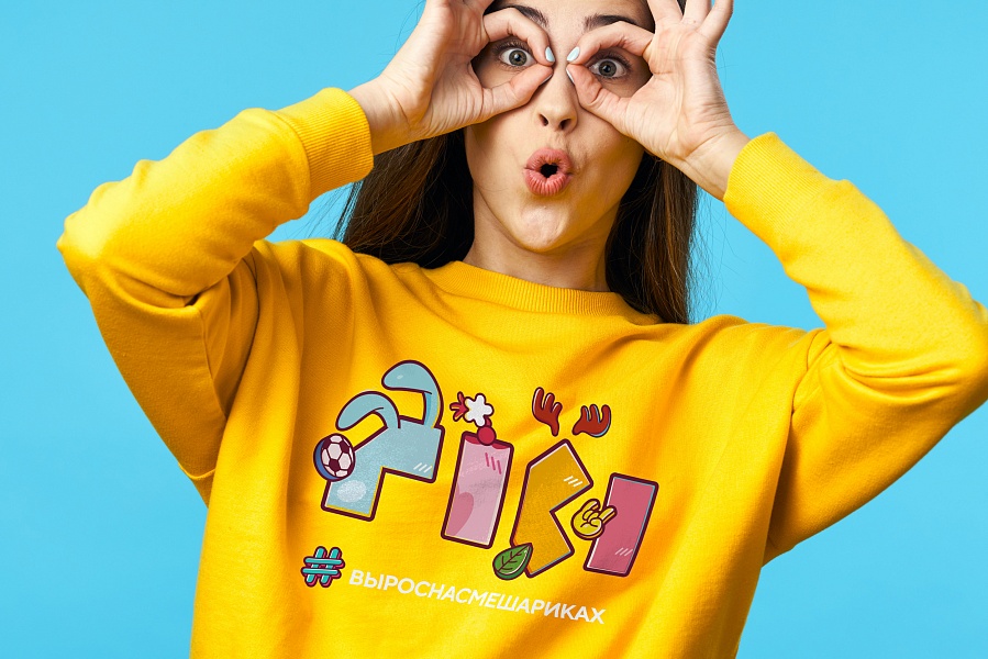
The new logo is formed of repeating elements based on elongated rectangles: in normal form they correspond to the Latin letter i, in folded form they correspond to the letters r and k. The logo is intended to be used, in particular, in the form of stencil windows that can combine elements of any brands included in the portfolio of the “Riki” company.
_ _ _ _
Riki Group has been one of the leaders of the Russian animation market for over 16 years with a portfolio of properties for kids of all age groups, including such successful Russian animation brands as Kikoriki, The Fixies, Pincode, BabyRiki and Tina & Tony. The shows have been broadcast in more than 90 countries and translated into over 50 languages and dialects. More than 100 hours of animation have been produced over these 16 years.
Today, Riki Group includes a production center, a design studio, two animation studios – Petersburg Animation Studio and Aeroplane, Marmalade Media – a multi-brand licensing agency, Smart Masha – a publisher of educational games and children’s literature, New Media – an online game developer, 4Screens – a studio for the production of children’s game content for YouTube, and other companies.